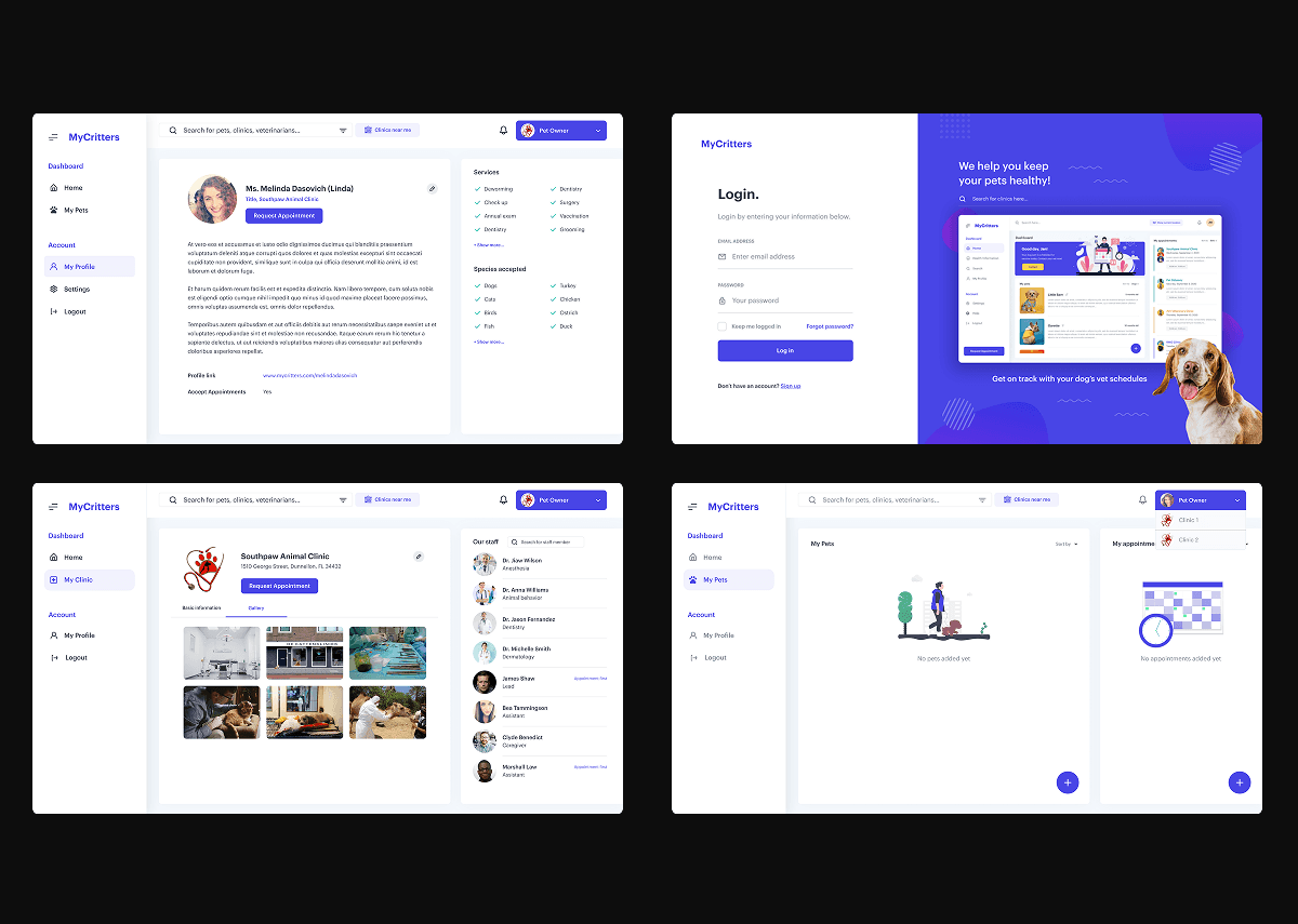
My Critters
I was brought in as a lead consultant to audit and overhaul the My Critters platform—a dual-sided ecosystem connecting pet owners with veterinary clinics. My objective was to resolve critical UX friction points, establish a scalable design system, and design a mobile-first experience to improve appointment completion rates and data accuracy for clinical use.

Phase 1: Heuristic Audit & Clinical Research
Rather than jumping straight into visuals, I conducted a deep-dive Heuristic Evaluation followed by targeted stakeholder research to identify why the existing platform was failing to convert users.
The Methodology:
Audit: Documented systemic failures in "Visibility of System Status" and "Recognition rather than Recall."
Stakeholder Interviews: I interviewed practicing veterinarians to understand their primary vs. secondary data needs.
Key Discovery: The original interface was "clanky" and redundant, causing high cognitive load. Veterinarians were missing critical health data because the information architecture didn't align with clinical workflows.

Phase 2: From Data Chaos to Intuitive Workflows
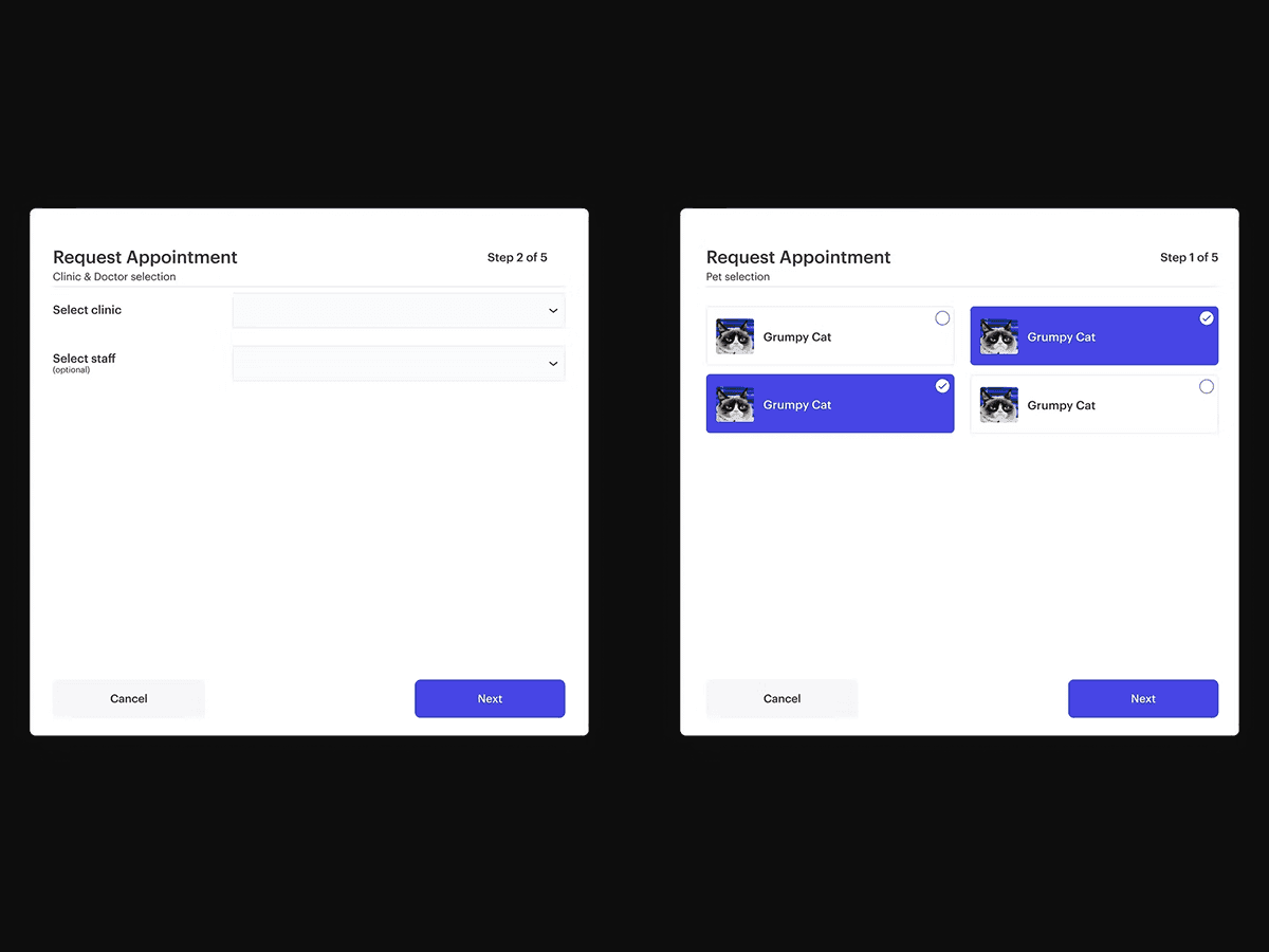
One of the most significant UX improvements involved the Appointment Request Flow. The original design used a single, overwhelming scrollable form with ambiguous labeling—a major risk factor for data error in healthcare.
The Solution: Progressive Disclosure Based on my interviews with medical staff, I restructured the process into a thematic multi-step flow.
Prioritization: We identified recurring medical issues and moved them to the forefront.
Efficiency: By separating the process into "Vaccines," "Health Issues," "Medication," and "Lifestyle," we ensured users could provide high-quality data without feeling overwhelmed.


Phase 3: Scaling via Design Systems
A major source of the platform’s technical debt was the lack of UI consistency. I developed a modular Design System using Figma Auto-Layout to ensure rapid iteration and responsiveness.
Systemic Upgrades:
Standardization: Unified button logic, input fields, and iconography to reduce user confusion.
Mobile-First Adaptability: Created a responsive framework that allowed the complex clinic dashboard to remain functional on smaller screens.
Error Prevention: Implemented real-time validation and descriptive error messaging to help users recover from input mistakes without frustration.
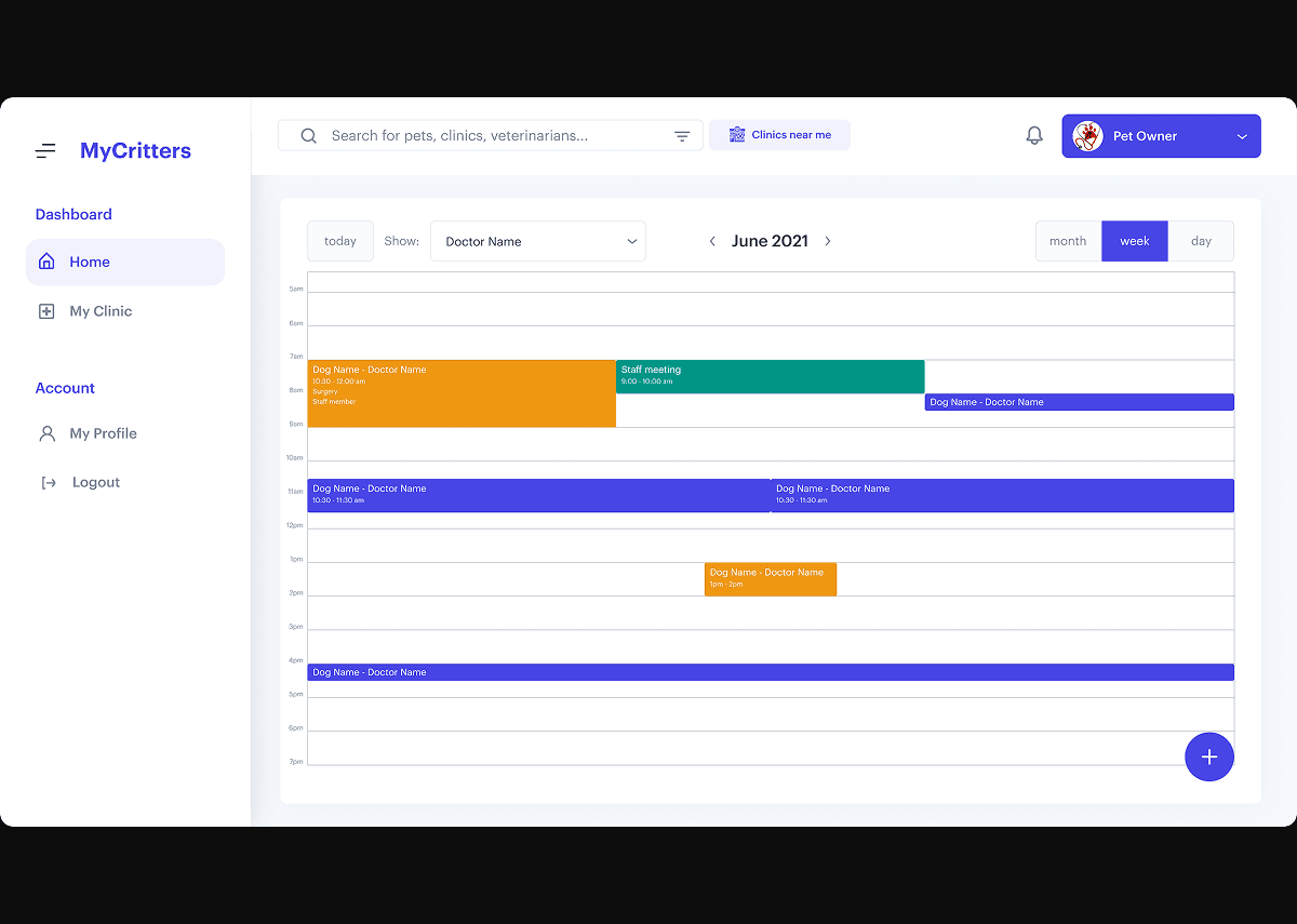
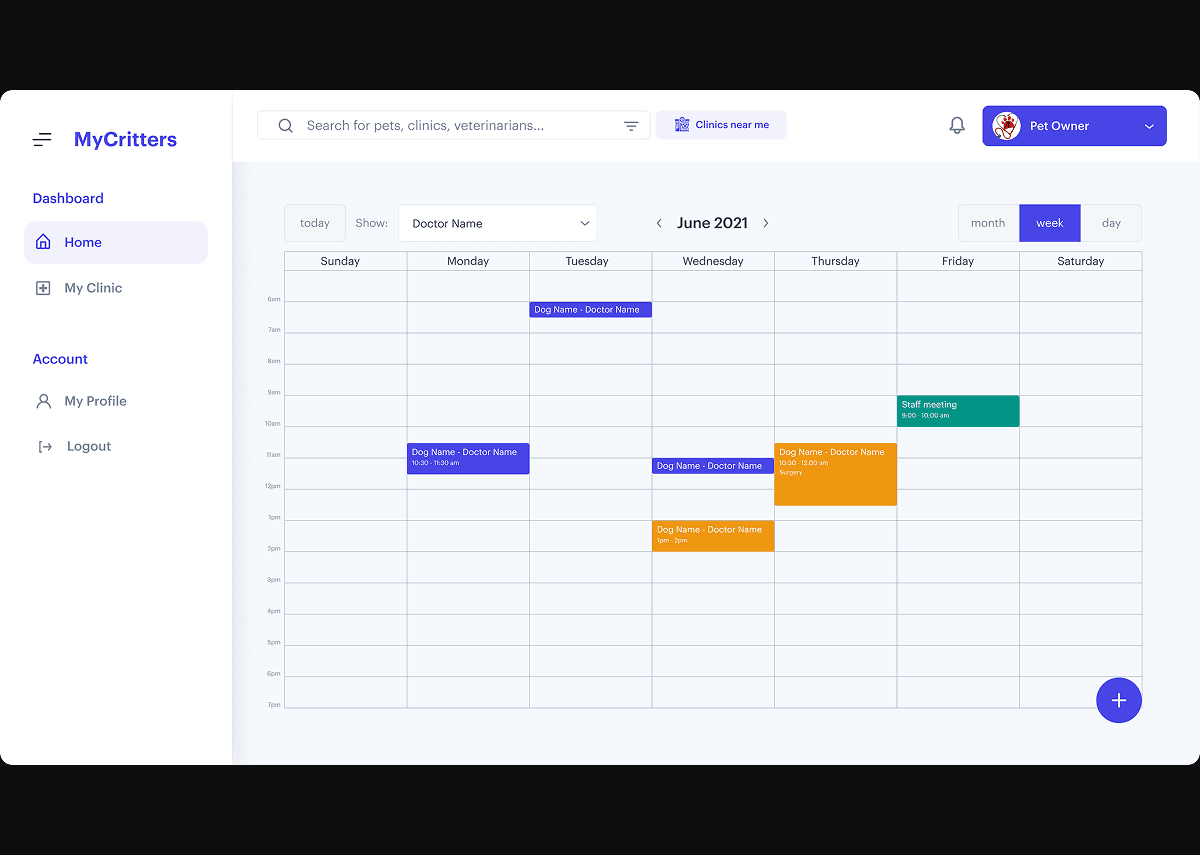
Phase 4: High-Stakes Logic & Dashboarding
For the clinic-side dashboard, I focused on Information Density vs. Readability.
Calendar Management: I designed a flexible calendar view (Daily/Weekly/Monthly) specifically for high-volume clinics to manage patient schedules.
Edge Case Logic: I mapped out complex UX flows for "Draft Appointments" and "Granular Permissions," ensuring that clinic admins could manage their staff without compromising data security.


Results & Impact
Reduced Cognitive Load: Simplified the pet onboarding process from one long form into 4 digestible modules.
Scalability: The new Design System allowed the development team to roll out new features 2x faster than previous sprints.
Clinical Accuracy: Post-launch feedback from veterinarians indicated a significant improvement in the quality of health data received prior to appointments.